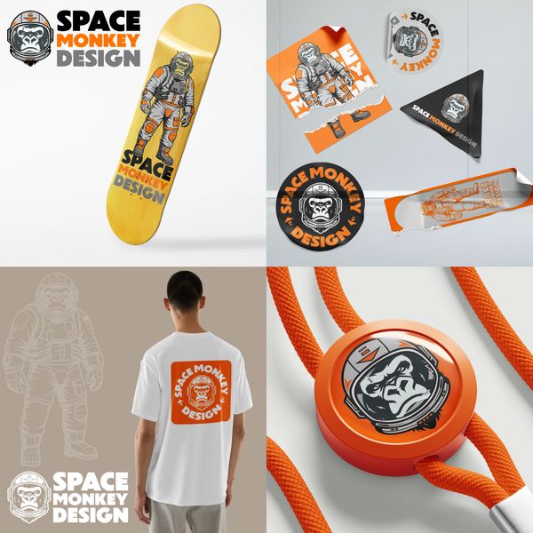
Space Monkey Design
Darren, approached us for a fresh identity for his company, Space Monkey Design. He wanted something distinctive that felt rooted in his personality and creative work. After exploring a range of early sketches, we developed a character-led mark featuring a gorilla in a space helmet. A confident, memorable symbol that captured both strength and imagination. The brand uses a striking palette of black, orange, and grey, paired with bold typography and playful applications across touch points. The outcome is a standout identity that gives Space Monkey Design a strong visual presence and reflects Darren’s creative edge.
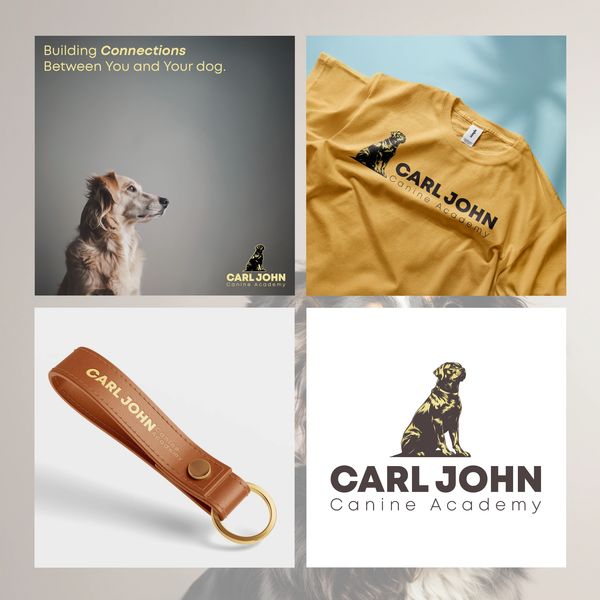
Carl John Canine Academy
When Carl approached us to create a brand for his canine academy, he wanted a visual identity that conveyed trust, loyalty, and professionalism. Together, we developed a master logo featuring a refined Rottweiler sketch, reflecting strength and character.
The earthy colour palette and elegant typography enhance the academy's commitment to quality and care, appealing to high-end clients while ensuring future growth. With this new brand identity, Carl John Canine Academy now stands out as a trusted authority in dog training. Carl is thrilled with the result and confident that the brand will evolve alongside his mission to foster strong relationships between dogs and their handlers.
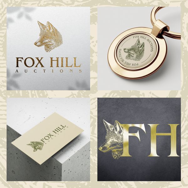
Fox Hill Auctions
Fox Hill Auctions approached us at the very start of their journey, with only a name and a vision. They wanted to create a distinctive brand that reflected their values and would appeal to their target audience of discerning buyers and sellers. We worked closely with them to develop a complete identity from the ground up. This included a refined logo, elegant typography, and a colour palette that conveyed a sense of heritage and trust. The branding extended across their website, business cards, advertising, posters, and vehicle graphics, ensuring a consistent and professional presence. The result is a polished, cohesive brand that positions Fox Hill Auctions confidently in their market. The client is delighted with the outcome as they prepare for a successful launch.
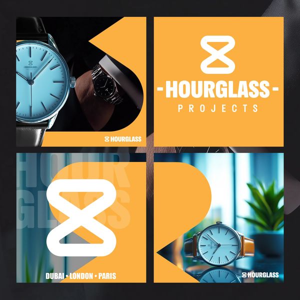
Hourglass
A London-based startup specialising in classic and traditional watches, sought a strong brand identity for their fundraising efforts. To embody their timeless aesthetic, we crafted a simple yet bold hourglass icon as their logo, paired with clean, elegant fonts. We chose a light orange and white colour palette to create a striking contrast against dark imagery, reflecting the brand's blend of tradition and modernity.

Local Link
We worked closely with Local Link Salisbury to develop a clean, user-friendly concept that would highlight the charm of local businesses while keeping things accessible and simple. The branding reflects the friendly and supportive ethos of the initiative, encouraging community engagement and collaboration.
This project embodies our passion for helping ideas come to life and showcases how thoughtful design can support local business growth.

Furnitech
Furnitech, a carpentry company aiming to specialise in bespoke furniture as a sideline to their main business, wanted to project an image of being established and professional, despite being a small startup. To support their vision for future growth, we crafted a strong brand identity featuring bold logos and carefully chosen font types. The use of powerful key and accent colours reinforced their professionalism, positioning Furnitech as a credible and capable player in the bespoke furniture market, ready for expansion.
Smooth Moves
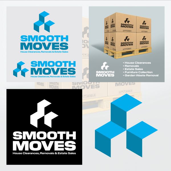
Smooth Moves, an exciting new venture by an old client entering the removals and clearances industry, wanted to establish a strong presence right from the start. Aiming to launch with a fleet of vehicles, they sought a brand identity that would set them apart from local competitors. We designed an icon that cleverly combined arrows for movement, boxes, and a bird into an isometric shape, symbolising efficiency and freedom. Bright colours and bold fonts were used to further emphasise their dynamic and professional image, ensuring Smooth Moves stood out as a major player from day one.
Clarkes Construction
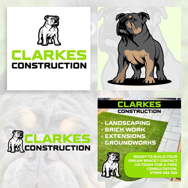
Clarkes Construction sought a rebrand that would closely reflect their passion—their beloved bulldog. We designed a mascot logo featuring the bulldog as the central focus, embodying the qualities of strength, integrity, and determination that the bulldog represents. This powerful symbol perfectly aligned with the company’s values, creating a memorable and fitting brand identity that resonates with their audience and reflects the core of Clarkes Construction.
BeeBlocks
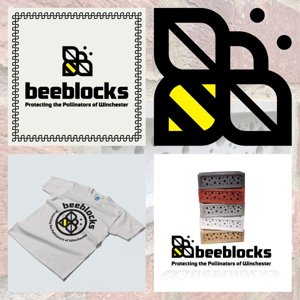
Bee Blocks, a Winchester-based builder, came to us with a unique concept — integrating bee-friendly blocks into new building projects to support biodiversity. They wanted a brand identity that would highlight their commitment to sustainable building while maintaining a professional image suited to the construction sector. We developed a clean, modern logo combining strong geometric forms with a subtle bee motif, reflecting both their craftsmanship and eco-conscious values. A natural colour palette of warm yellows and earthy greys was chosen to balance approachability with professionalism. The final identity gave Bee Blocks a distinctive, credible presence that helped communicate their innovative approach to potential clients and partners.
Gene Switch
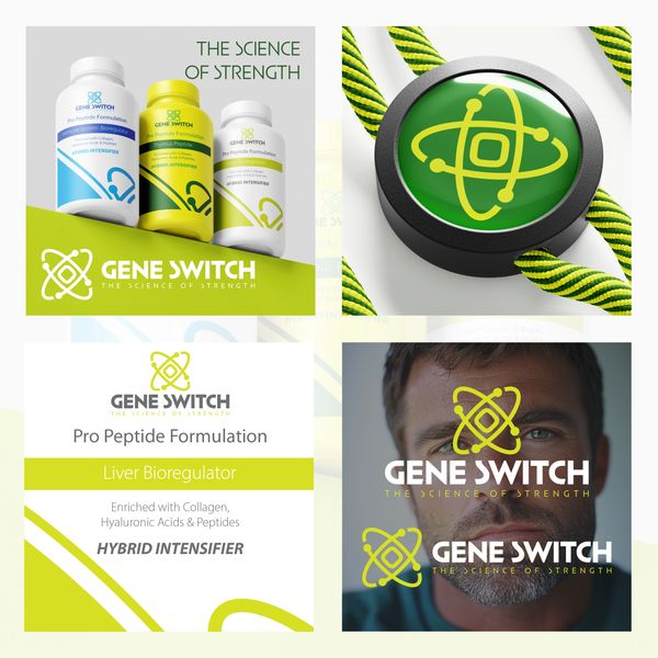
Gene Switch, a company specialising in peptide formulas, approached us for a new brand that would carefully balance a medical aesthetic with a professional, attention-grabbing appeal. Their new brand needed to resonate within the health industry while also standing out in a competitive market. We designed a brand identity that blended clean, clinical visuals with modern, professional elements. By using a sophisticated colour palette and precise typography, we created a look that was both visually striking and relevant to the health sector. The result was a brand that captured attention while maintaining credibility and trust within the medical field.
Case Study Examples & Brand Identity Design

Capricorn
Capricorn, a small cleaning company, sought to upscale their brand to attract larger clients. Their original identity needed a more professional appearance, so we rebranded with a focus on the Capricorn star sign, introducing a goat icon to symbolise strength and reliability. The design incorporated mid blues and white to evoke cleanliness, with subtle star accents to suggest a sparkling finish. The result was a clean, appealing, and professional brand identity that effectively positioned Capricorn to reach and appeal to a broader, more prestigious clientele.

Aztec
For this project, Slam Creative collaborated with an old friend from college who founded 'The Aztec Collective,' a street performer group in Melbourne.
Tasked with creating a logo and advertising materials to attract investment for a European tour, we designed a vibrant Aztec-style character as the mascot, paired with playful, engaging text to capture the collective's dynamic spirit. This branding not only reflects the unique cultural influence of the group but also sets the tone for their exciting journey ahead.

Rum Machine
A Scottish company importing rum from Puerto Rico was looking for a concept brand for their new rum, aiming for a pirate theme without using traditional pirate imagery. Inspired by this challenge, we developed a bold brand identity centred around a skull logo, subtly incorporating a parrot skeleton. Collaborating closely with the client, we crafted bottle designs, labels, and marketing materials that conveyed the premium nature of the rum while evoking a sense of exploration.

Node
A revolutionary commercial cooling systems company sought a rebrand ahead of their 2025 launch campaign. We discovered their advert for a logo designer and reached out to offer our services.
We developed a brand identity featuring a Finch icon, symbolising their transition from the old company name to a larger, forward-thinking corporation. The Finch represents agility and growth, aligning with their innovative vision.
The rebrand positioned Finch Cooling Systems for a successful launch, reflecting their advanced technology and corporate evolution.

Inkling
The team at Inkling came to us with an idea for a brand that is clean, classic, and approachable. They wanted a logo featuring a fountain pen to symbolise the creativity central to their work in writing, art, and design.
We developed a brand identity for Inkling that embodies simplicity and elegance. The logo, featuring a stylised fountain pen, conveys both tradition and innovation. We used a timeless font and a soothing colour palette to enhance the approachable feel.
Inkling now has a clean and classic brand identity that effectively represents their creative spirit. The new branding resonates well with their audience, making the company more memorable and appealing.

Amber & Olive
The Ricci family approached us to brand their new Sicilian restaurant, Amber & Olive, in Chichester. They wanted an upmarket vibe with a clean, modern look that reflects their Sicilian and Syrian heritage.
We collaborated with them to create a sophisticated brand aesthetic, featuring elegant typography and a refined colour palette inspired by their diverse roots.
Amber & Olive now boasts a contemporary yet culturally rich identity, aligning with the Ricci family’s vision for an upscale dining experience. They are confident this will attract both investors and future patrons.

Genesis
Jade sought to merge her two companies into one unified brand while retaining flexibility for future growth. She desired a name and brand aesthetic that would stand the test of time and accommodate potential expansions.
Collaborating closely with Jade, we selected the name "Genesis" to symbolise new beginnings and growth. The Tree of Life was chosen as the logo, reflecting vitality and interconnectedness. We opted for a clean font and a vibrant colour palette, handpicked by Jade, to enhance brand appeal.
With the new brand identity, Genesis embodies Jade's holistic approach to wellbeing. The flexible design ensures adaptability for future services. Jade is thrilled with the outcome and confident in the brand's ability to evolve alongside her business ventures.

Loggerheads
A Canadian skincare and hair care company, known for their women's products, aimed to enter the UK market with a range specifically tailored for men.
Inspired by the vast forests of eastern Canada, we crafted a brand identity that exuded rugged masculinity and natural authenticity. Targeting hardworking men unfamiliar with skincare, our marketing strategy emphasised practical benefits and the transformative power of Canadian Wilderness skincare. The market test response was overwhelmingly positive, with the brand quickly gaining traction among our target audience.

Lazarus
Dean, a Salisbury-based entrepreneur, approached his venture with a mix of excitement and uncertainty. Seeking to bolster his confidence, we delved into the world of branding to refine his vision. Inspired by Dean's journey of resilience, we named the brand Lazarus, symbolising his triumphant rise from adversity. Tailored for discerning clients seeking high-end home alterations, Lazarus exuded sophistication and refinement.
Through meticulous design choices and a refined colour palette, we crafted a brand identity that resonated with Dean's target audience. Lazarus - Bespoke Home Alterations emerged as a beacon of quality and craftsmanship, capturing the essence of Dean's expertise and dedication. With renewed confidence in his venture, Dean embraced the brand wholeheartedly, ready to make his mark in the world of home alterations.

Drunken Chicken
Drunken Chicken, a start-up based in Camden, aimed to revolutionise home delivery cuisine with their chicken dishes inspired by Chinese and Korean flavours. Seeking a fun and memorable brand, Kat and Bo wanted a unified identity that would stand out in central London and scale nationally.
Our challenge was to create a brand that captured Drunken Chicken's playful spirit while maintaining a serious business aesthetic. Drawing inspiration from their eclectic menu, we crafted a logo and packaging designs that were visually striking and practical for takeaways.
The result was a solid brand identity that will be well-received by customers in central London and lay a foundation for national expansion.

Sandstone
Sandstone, a Nevada-based finance company positioning itself as the future of finance, approached us after meeting our brand designer at a convention, to create a brand that was sophisticated yet approachable. As a sister company to one of the USA's leading banks and situated in Silicon Valley, Sandstone aimed to revolutionise banking by integrating traditional finance, cryptocurrency, and NFTs into one seamless platform.
Our challenge was to develop a brand identity that exuded sophistication without alienating potential customers. Drawing inspiration from Sandstone's innovative vision, we curated a palette of dark greens, mint greens, and gradients to reflect their forward-thinking approach.
Collaborating closely with the Sandstone team, we crafted a cohesive brand identity that resonated with their high-wealth, high-earning target audience while remaining inclusive to all. Sandstone's launch will mark a significant milestone in the financial industry, setting a new standard for excellence in the digital banking landscape.

Proper Gander
When Jakki McKay and her family approached us for advice on branding designs for their upcoming Australian wine label, Proper Gander, we were very excited. Inspired by the picturesque vineyards of Freycinet, Tasmania, we aimed to balance sophistication with fun.
Incorporating earthy tones with hints of vibrant colour, we captured Proper Gander's essence - a brand that exudes elegance with a touch of playfulness. Collaborating closely with the McKay family, we refined the visual elements to reflect the brand's personality and values.
Despite challenges, such as finding the perfect balance between elegance and humour, our efforts resulted in a cohesive brand identity. Set to release in mid-2025, Proper Gander is poised to make a lasting impression on wine enthusiasts worldwide.
Copyright © 2025 Slam Creative - All Rights Reserved. St Peters Place, Salisbury, Wilthsire.